That does fix the issue.  Usually, dark mode themes would break when that’s turned on, so theme creators usually say to leave that off. I assumed that’d be the case here as well, my bad.
Have I mentioned how beautiful the colours for the Links, Todos and Blue & Purple Highlights are?
Didn’t expect for it to go from a Light to a Dark theme but you won’t hear any complaints from me.
Reports:
Extra space around email. Colour and spacing fixed on click:
There may some other paragraphs that shift around or hover or click (can’t remember), similar to the email behaviour. Will post them when I reencounter them, noticed them when I copied your code.
Also,
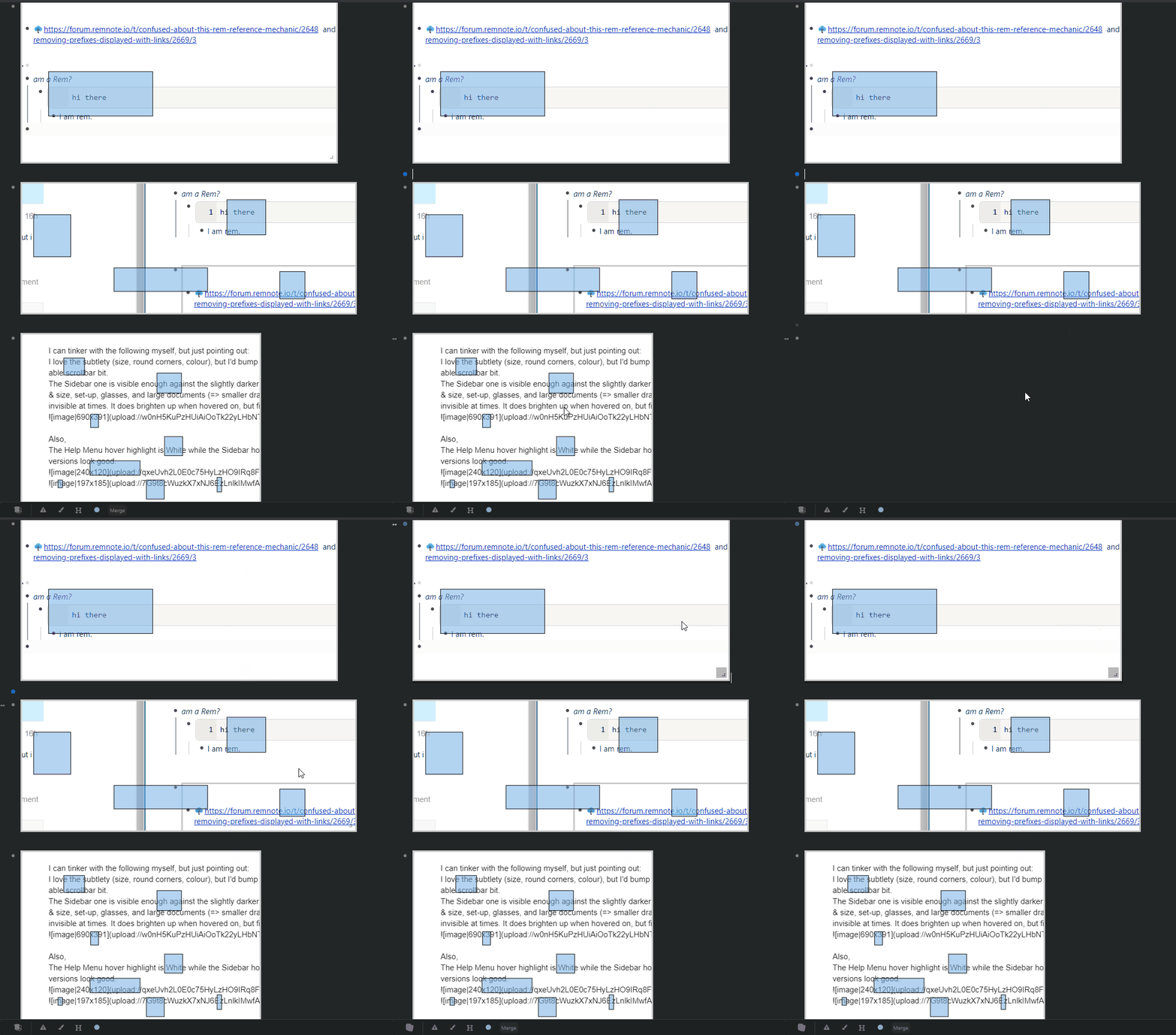
Image Occlusions are flickering unless the cursor is clicked into the Rem that holds them:
Feedback:
I can tinker with the following myself, but just pointing out:
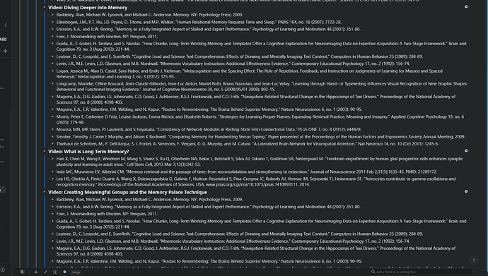
I love the subtlety (size, round corners, colour), but I’d bump up the colour of the Hierarchical Editor drag-able scrollbar bit.
The Sidebar one is visible enough against the slightly darker Sidebar background but the monitor angles & size, and large documents (=> smaller drag-bit) do make the Hierarchical Editor one invisible at times. It does brighten up when hovered on, but finding it is a bit difficult. Could be my screen calibration, set-up and glasses interfering as well tho.
The blue line is from my monitor, ignore that. The drag bit is positioned lower than the middle of the image.
Also,
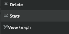
The Help Menu hover highlight is White while the Sidebar hover highlight is Grey/Blue (depending on the monitor & angle I look at). Is that intended? Both versions look good, is a question of adherence to consistency.





 .
.
 .
. . Thank you very much for the fix, I will include your code in the next update.
 , so I will make them optional.
