Fantástico! Muchísimas gracias!!! 
Siempre a la orden. Cheers
@Eustachio
Hey, as everybody else, I find your aesthetic for remnote quite cool 
I have 3 remarks/questions to ask you about
-
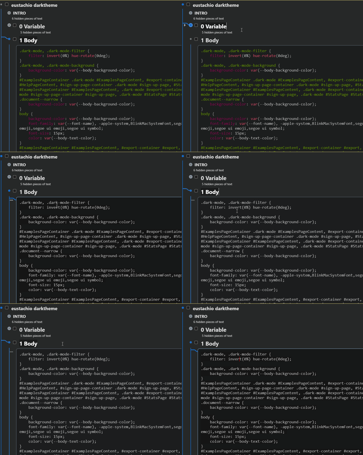
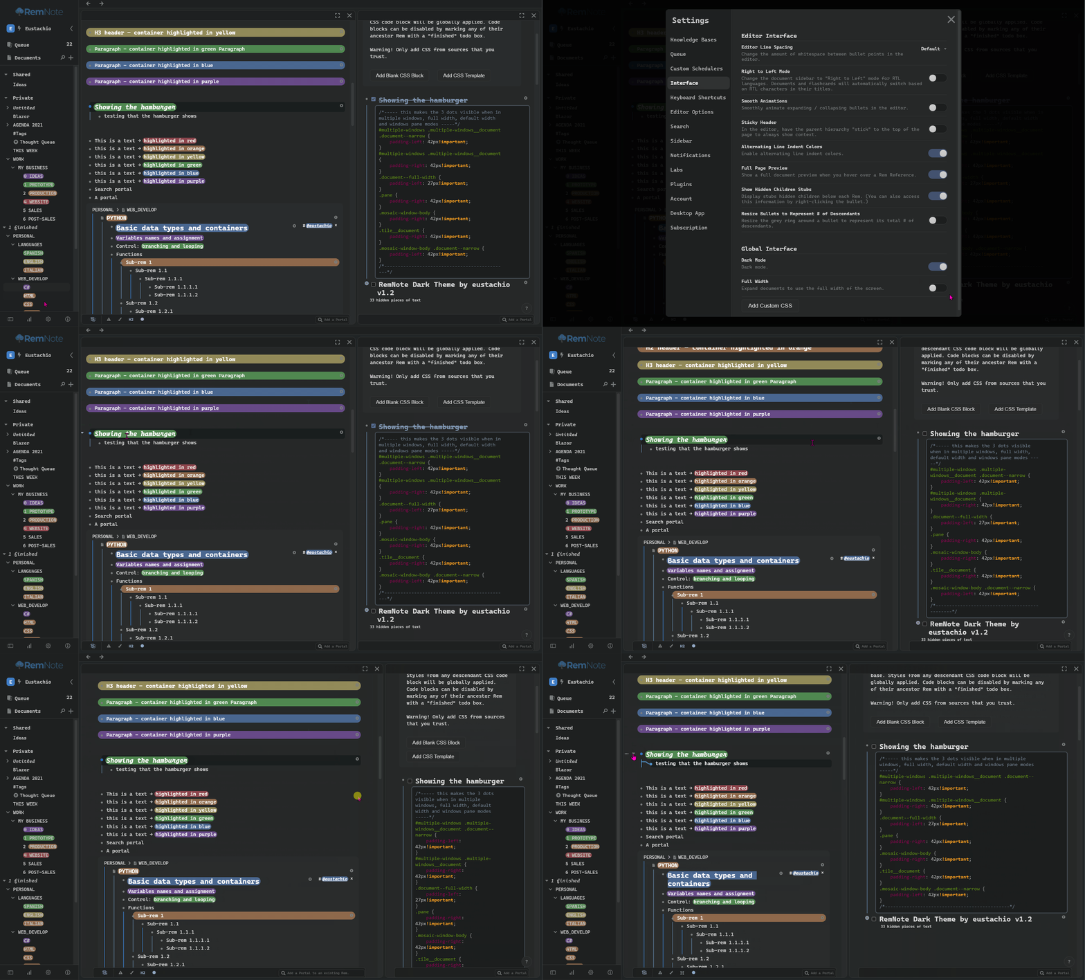
I have an issue with the display of code blocks, and it depends on the mouse position and focus:
-
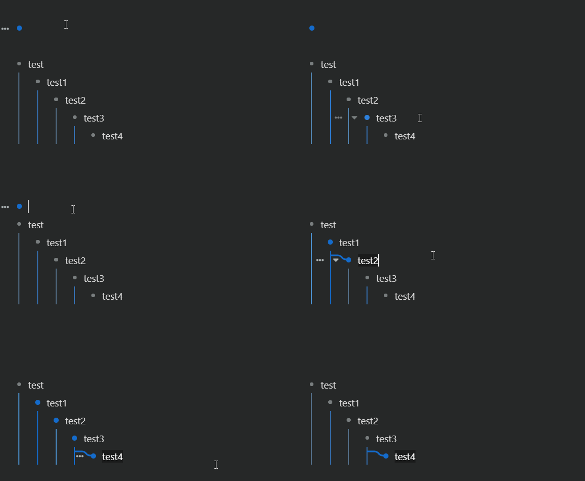
I really like your design, and the branch aesthetic in particular.
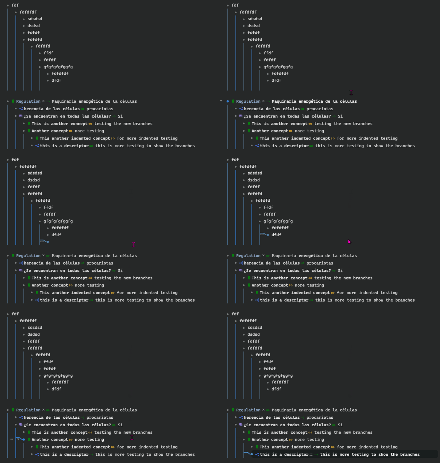
I would like to have the branching appear only for the branch in focus, and map back to the “chain of parenthood”. The other branch might be greyed out or non-apparent even.
How would you go about that?
-
I like working in wide-mode (meaning with unconstrained width). This is not related to your design, but looking at your code, I figured you might have an idea. Otherwise, I’ll add a feature request for this.
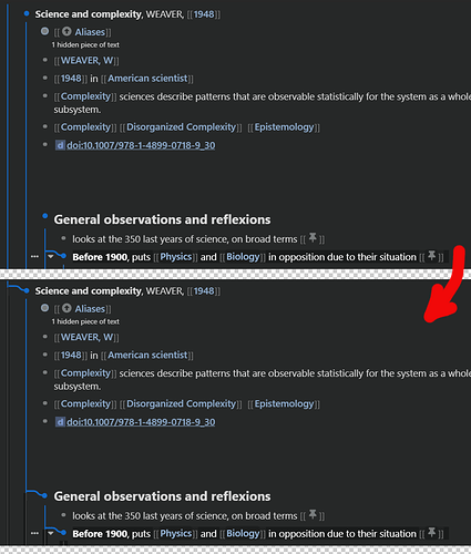
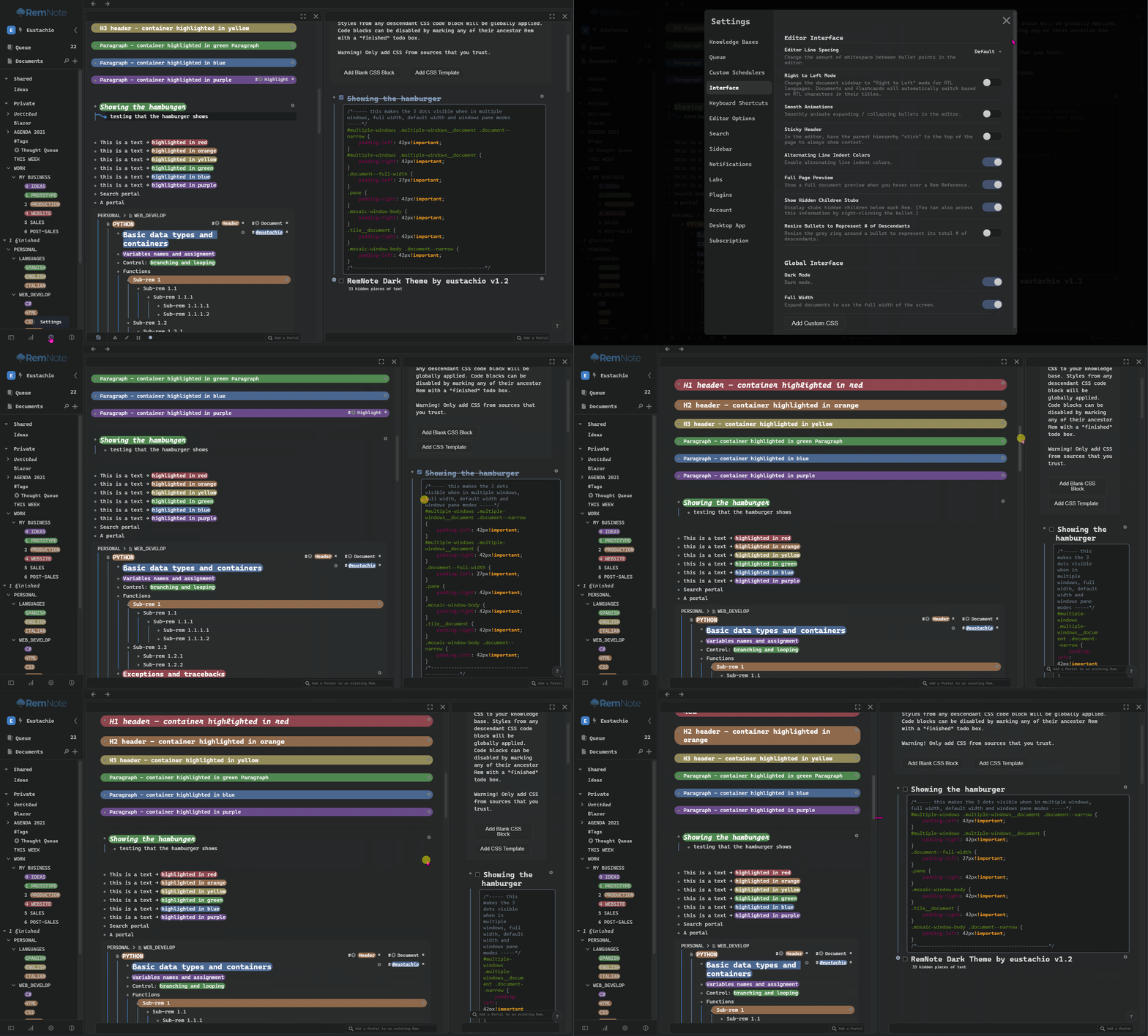
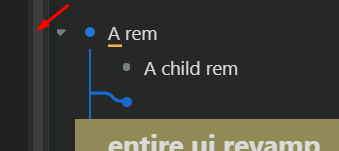
When in wide mode, the “…” icon, left to the bullet point in focus is pushed further left when there is a child to this rem, making clicking on “…” impossible.
Do you have an idea on a remedy?
Thanks 
I also might add that in the example shown in the pictures, all other CSS block have been deactivated: there is no conflict.
Hi @_yb thanks for your feedback and for reporting these bugs.
Answers:
-
Code blocks, please someone correct me if I am wrong, but I think this is a RemNote issue, I have the same problem when the code blocks get too many lines of code. So I use vs code to edit the code blocks instead. Maybe @hannesfrank could help us with this. Cheers
-
This is how originally the branches should look
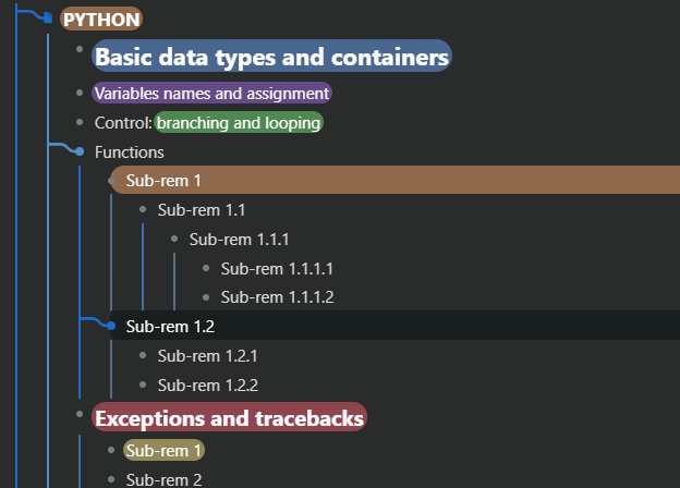
For what I can see in your screenshots, these parent branches when in focus are not showing, are they? And for the suggestion of making the lines grey like you show in the screenshot, I tried to do that before and I could not do it with only CSS, maybe something to do in the future. -
Here the fix, if you go to 1 Body
replace this code:
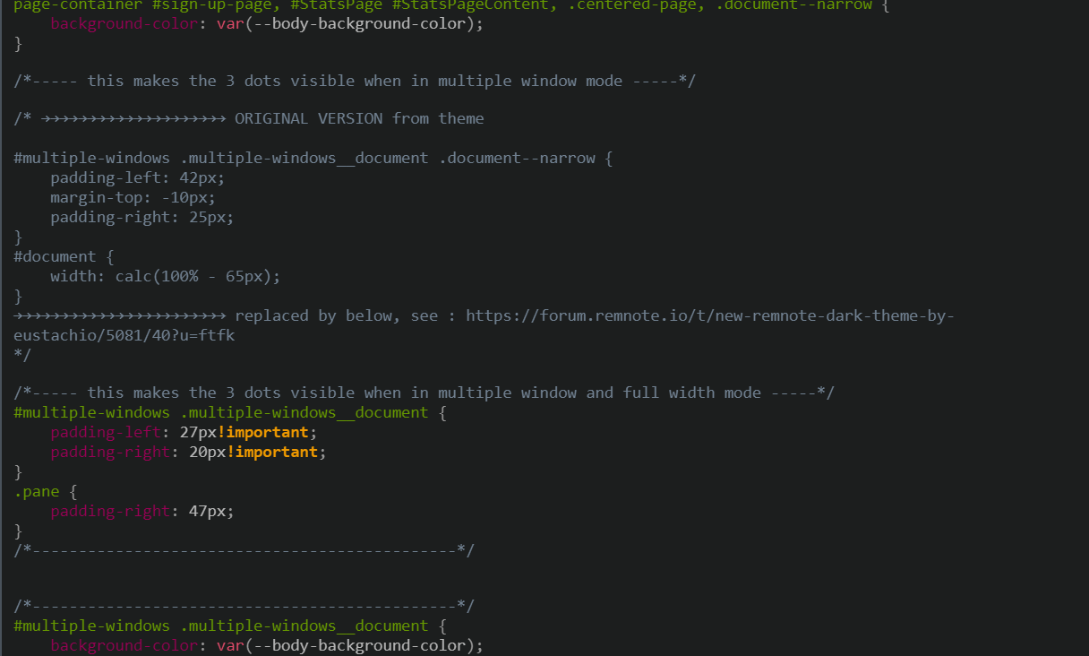
/*----- this makes the 3 dots visible when in multiple window mode -----*/
#multiple-windows .multiple-windows__document .document--narrow {
    padding-left: 42px;
    margin-top: -10px;
    padding-right: 25px;
}
#document {
    width: calc(100% - 65px);
}
/*----------------------------------------------*/
and replace it with this:
/*----- this makes the 3 dots visible when in multiple window and full width mode -----*/
#multiple-windows .multiple-windows__document {
    padding-left: 27px!important;
    padding-right: 20px!important;
}
.pane {
    padding-right: 47px;
}
/*----------------------------------------------*/
Code Blocks
see Hannes’ answer:
Branches
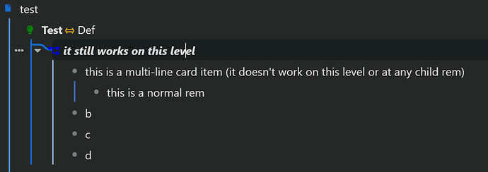
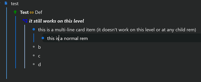
I don’t have the parent branches either and branches aren’t visible if I focus on a rem that is a multi-line card item or the rem has a multi-line card item as a parent. See the pictures below:
-
focus on normal rem:
-
focus inside multi-line card item:
I can do some testing/debugging if you can’t reproduce the issue.
Just for information:
- I’m using v1.2 of your great theme
- I’m using Microsoft Edge (Chromium)
- RemNote v1.3.17 beta
thank you very much for your answers
blocks: I’ve tested it, I have the same result without your theme, sorry for this confusion from my part 
branch: I’ve reinstalled your theme, and disabled other CSS. I really don’t understand why I’m not seeing the parents ‘branch’… any idea on how to track the problem?
widemode:
So, I’ve installed the fix:
the result is the same

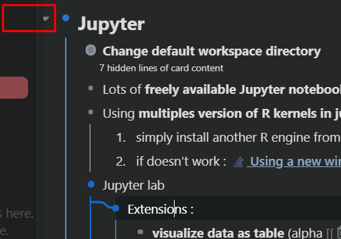
You are very kind to help us with these issues, thank you 
Hi @Henrik
Thanks for sharing the article about the code blocks, I didn’t know about that. Cheers!
Thanks for your help, yes I will appreciate some help  .
.
I will investigate the branches in more details, maybe I will move them to another level, I know that I made them not to show within multi-card items as I thought that could have been confusing but maybe it is more confusing if they don’t appear  , I will do some testing next week and I will let you know. Cheers!
Hi @_yb
It is okay, you’re welcome!
CodeBlocks: No problem.
Branches: I will investigate the branches system in more details next week, I will let you know.
Full Width mode: Can you please try this new code in 1 Body:
Replace this code:
/*----- this makes the 3 dots visible when in multiple window mode -----*/
#multiple-windows .multiple-windows__document .document--narrow {
    padding-left: 42px;
    margin-top: -10px;
    padding-right: 25px;
}
#document {
    width: calc(100% - 65px);
}
/*----------------------------------------------*/
with this new code:
/*----- this makes the 3 dots visible when in multiple window and full width mode -----*/
#multiple-windows .multiple-windows__document .document--narrow {
    padding-left: 42px!important;
}
#multiple-windows .multiple-windows__document {
    padding-right: 42px!important;
}
.document--full-width {
    margin-left: 42px!important;
}
.pane {
	padding-right: 42px!important;
}
/*----------------------------------------------*/
I hope it works this time.
Cheers,
Eustachio
Thanks 
it does move the whole thing to the right a bit, the “…” is indeed now visible, I’m super happy with that 
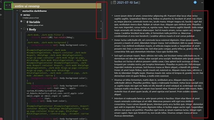
This has created another problem to the right of the window(s). This happens in wide mode, both in multi windows and single windows. Text is cut out, the power up and tags also as you can see on the picture.
If you have a solution for the branches don’t hesitate also to reach out to me  Also thank you so much for your work, it is really really appreciated.
Hi @_yb,
.pane was supposed to fix that and for some reason is not happening. I will check that again soon, sorry about that. Thanks for letting me know. Quick question, what operating system are you using?
Thanks for your answer,
I’m using Edge on Windows 10
Hi @_yb , I think I have found why the code I posted wasn’t fully working, I think it is because you might have the lab feature Windows Pane activated. If that is the case, can you please try this new code:
Again, in the 1 Body block, replace this code:
/*----- this makes the 3 dots visible when in multiple window mode -----*/
#multiple-windows .multiple-windows__document .document--narrow {
    padding-left: 42px;
    margin-top: -10px;
    padding-right: 25px;
}
#document {
    width: calc(100% - 65px);
}
/*----------------------------------------------*/
with this new code:
/*----- this makes the 3 dots visible when in multiple window, full width and windows pane modes -----*/
#multiple-windows .multiple-windows__document .document--narrow {
    padding-left: 42px!important;
}
#multiple-windows .multiple-windows__document {
    padding-right: 42px!important;
}
.document--full-width {
    padding-left: 27px!important;
}
.pane {
	padding-right: 42px!important;
}
.mosaic-window-body {
    padding-right: 42px!important;
}
.tile__document {
	padding-right: 42px!important;
}
/*----------------------------------------------*/
I hope this time works 
Cheers,
Eustachio
you are an actual wizard, aren’t you? 
This works perfectly! Thank you so much, see below
I’m perfectly happy with your implementation because I use full width mode, however people using multipanel + “constrained width” will still have the same behaviour as before, but only when the width of the browser window is < than the constrained width; I hope you understand what I mean. Not really a problem I think, but I thought I might let you know about it 
thank you so much 
@_yb I am happy to hear that it works, thanks for pointing that out.
This is the final code for everyone to use it. I will include this code in the next update too.
It should work in every scenario:
Windows Pane ON and OFF
Full Width ON and OFF
In the 1 Body block, replace this code:
/*----- this makes the 3 dots visible when in multiple window mode -----*/
#multiple-windows .multiple-windows__document .document--narrow {
    padding-left: 42px;
    margin-top: -10px;
    padding-right: 25px;
}
#document {
    width: calc(100% - 65px);
}
/*----------------------------------------------*/
with this new code:
/*----- this makes the 3 dots visible when in multiple windows,
default and full width modes and when windows pane lab feauture is ON and OFF -----*/
#multiple-windows .multiple-windows__document .document--narrow {
    padding-left: 42px!important;
}
#multiple-windows .multiple-windows__document {
    padding-right: 42px!important;
}
.document--full-width {
    padding-left: 27px!important;
}
.pane {
	padding-right: 42px!important;
}
.mosaic-window-body {
    padding-right: 42px!important;
}
.tile__document {
	padding-right: 42px!important;
}
.mosaic-window-body .document--narrow {
	padding-left: 42px!important;
}
/*----------------------------------------------*/
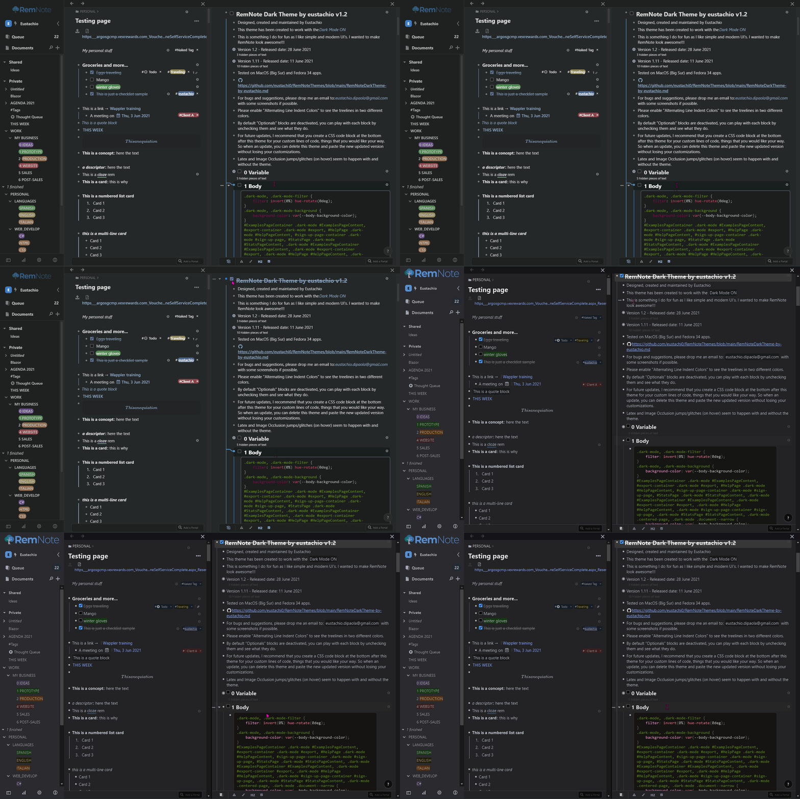
here some gifs
Windows Pane ON - Full Width OFF
Windows Pane ON - Full Width ON
Cheers,
Eustachio
thank you! its works wonderfully 
one last thing, could you point me to which chunk of the css is responsible for the branches? I will also try to play with your code and try to understand why it is limited to the active rem, and not its parents and grandparents
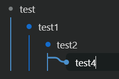
cheers !
Yes, I was actually investigating the branches yesterday, can you please tell me if the branches work on hover like in the gif below:
Cheers
Would love to see that code as well or just to see as its won snippet
Reminds me of the one that Roam has
It is great
Hello Eustachio!
This is what happens for me (all other CSS being off):
