Been using 1.4 beta for a couple of days. Looks really good, better UI and very slick.
Couple of comments. (I’m going to repeat some comments other uses have made, but I cant find them on the forum again to reply/support )
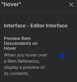
I do miss being able to mouse over documents on the right-hand pane and see popups. It was very useful to be able to quickly remind myself of what they were - especially if I was looking for a rem I had created in a Daily document. Now I have to go into each one I haven’t finished with yet to find the Rem I was working on (not something I could do with a portal or a search). Its very distracting.
As a fairly new user, I have been struggling with RemNote in general. I watched the videos and tried to use the built in help and tutorials to go forward. But I have found that I spend more time trying to learn how to use RemNote rather than using it, so new/revised tutorials would be most welcome.
Has number of flashcards to study disappeared? I only have about 30 at the moment, and the repetition is a little spread, but unless I click on Flashcards, its not showing me that I have some to study.
I cant find the button to open a Rem in a second window - has this moved, been removed. Its fine to open a rem in another window by clicking on the 6 dots, but if you want another plane open and go hunting for a rem via documents its a bit of a distraction and not very intuitive.
I understand the ethos of making ‘focus on what your working on’ the priority, but there does seems to be a lot of ‘white space’ between the left hand side of the screen and the column position for the first Rem indent. Is it possible to make this white space configurable in the settings?
Martin (cant find the forum post) replied to a comment about header 1 formatting being changed to remove the background shading. He suggested that more experienced users of RemNote could use CSS to tailor it to their needs. The only issue with this is that users like me don’t know CSS (yet), I’m not particularly keen to get involved with CSS and have now lost some functionality in 1.4 that I had in 1.3 which did improve the visual aspect of RemNote.
One of the more general impressions I get with RemNote is that there is an assumed level of user awareness of “mark down” and how its used. I have a history in the computer industry and although the first program I ever wrote was in machine code on punch cards and and ran on an IBM 360 mainframe I have not kept up with the the more recent developments in HTML, Mark Down and Web based programs. I offer this comment to feed into the discussion about the new tutorial videos that are in the works. It would be useful to include pointers to how the program is structured behind the UI, maybe thinking/considering the potential user base and how they might understand it. I had to implement a control system in a repair workshop once, and most of the time I had to explain to highly skilled electronic technicians and engineers the concepts of process control just so they could grasp why they were having to press function keys to make the software work. This translates to a concept Rem followed by descriptors as reminders followed by grandchildren descriptors that explain why you have to do it this way and what could go wrong if you don’t.
Finnnnnnaly
Any news on the IOS app? There are some nice new features in IOS 15, and my current work flow is using the IOS Notes app on my iPad throughout the day, then transcribing into RemNote via safari but the lack of a tab function on the iPad (software) keyboard, means I then have to edit my rem’s on a computer - so I’m handling the data 3 times. 
Mark


