There is still no paypal option to buy safely in the v1.4 
This is fantastic. Thank you for your efforts. 
i am facing issue with sidebar flickering when making notes with pdf opened in side screen. this is not good… please check and resolve this…
btw editor is great and page loading has improved a lot… i liked the idea of using ;; for cards- thats great… requesting team to update the documentation in line with the update.
for the first time since initial days of remnote launch i can say that remnote is moving in right direction and has now become my main note taking system. thanks again.
Hello Remnote team, the update is fine, but I have found some bugs so far
-
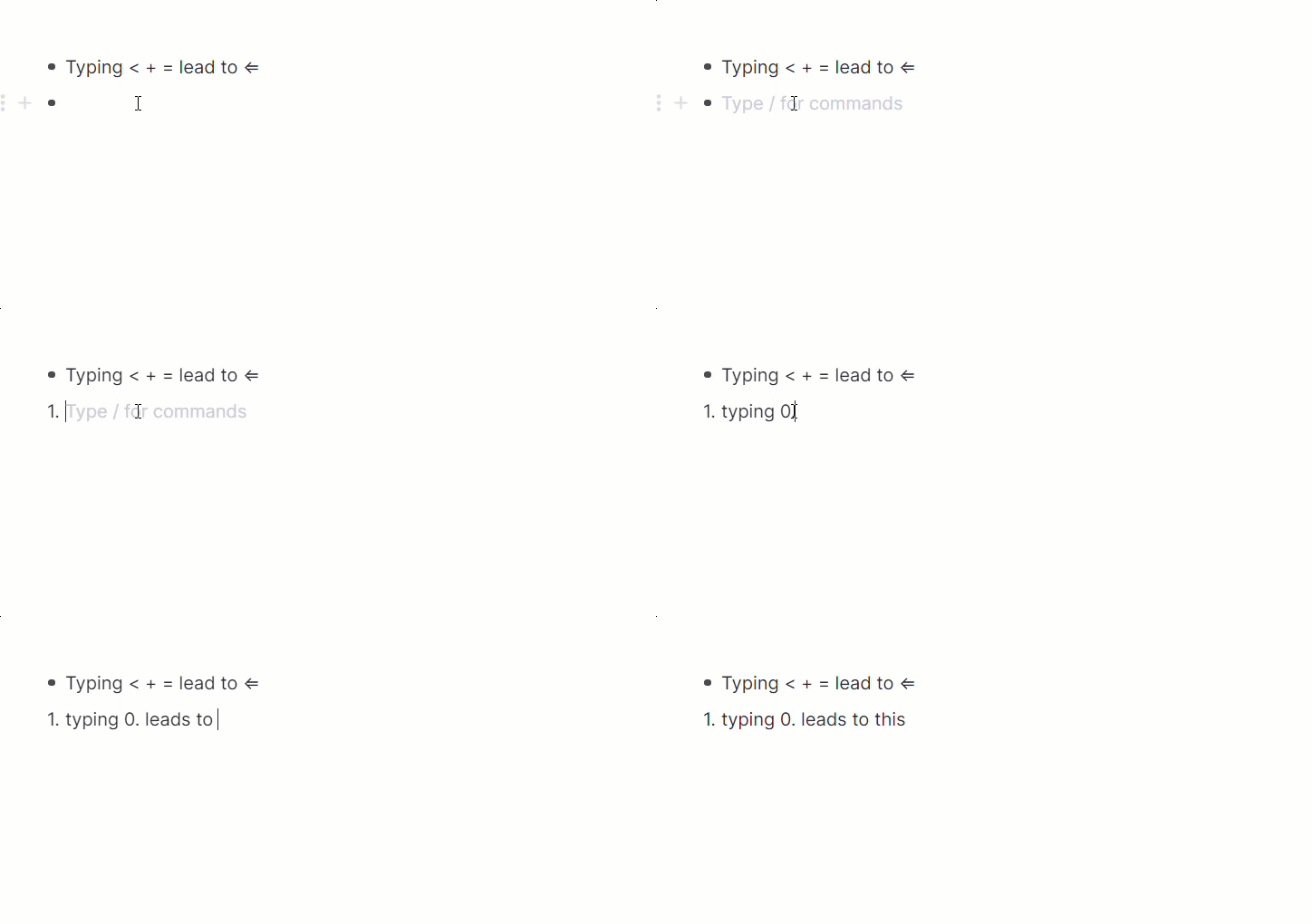
Typing
≤ leads to backward arrow
(0.) leads to 1.
-
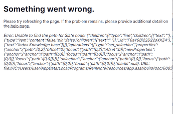
Sometimes when I click on a rem/document this appears, I don’t know what triggers it
-
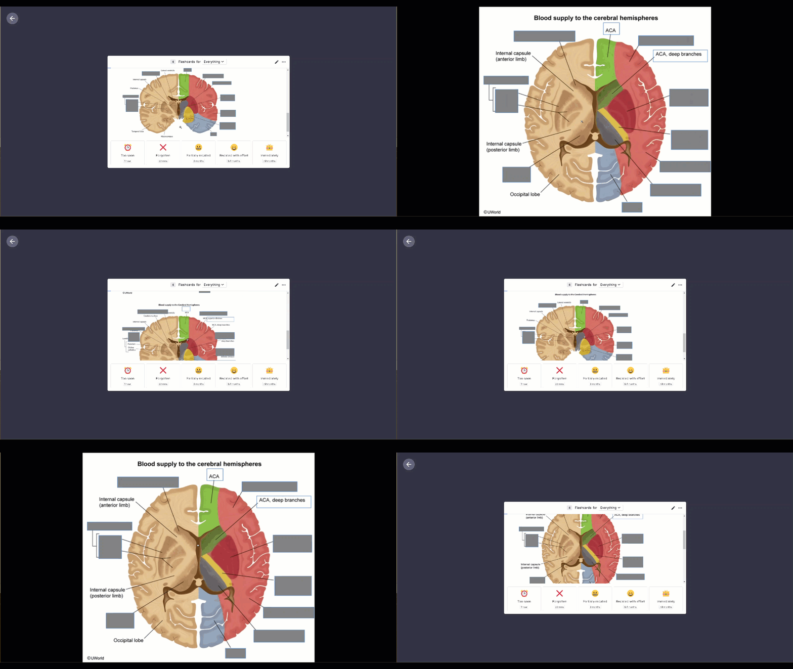
problems with the image occlusion as you can see
-
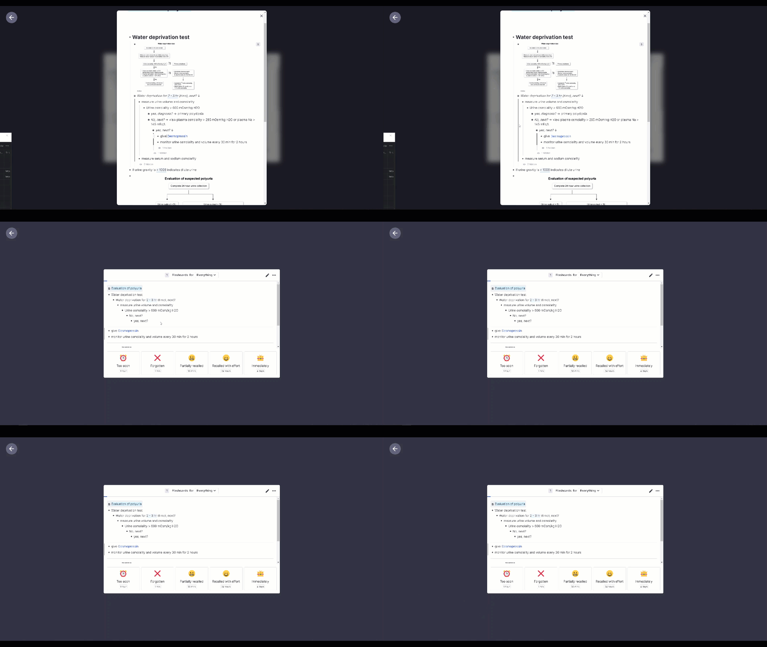
fails to give context
We’re working on adding additional payment methods - definitely something we want to do 
Hi - do you mean the left sidebar is flickering? It is possibly because you’re entering and exiting focus mode? I’m having trouble reproducing this.
Yep, we’re working on updated documentation!
Thanks for the reports!
To clarify, is the problem with the image occlusion in your 3rd screenshot that its cut off and you have to scroll?
Thank you Martin, The problem is that the cloze part appears disarranged, showing the text within the occlusion, when I double click in one image it is fix temporary, but the other image again appears disarranged, and vice versa
Another problems  that I have been finding while using the app are
- some images appear distorted coping to remnote, but normal in other apps
- How can I preview cloze cards?
- How can I know if a rem is an extra card detail (does not show me an indicator like the previous version)
Thanks very much for the update. I have tried to find it but is there Mulitiple Pane View? I assume it only works in web version with the address not app at this stage. Is this correct. Will keep posting comments but its an improvement. Really looking forward to when the ios app for phone can do !! or ##
Do you have an estimate of when you’ll be releasing this to the public?
Currently testing out compiling my feedback on the 1.4 version! I think it’s going to take some getting used to.
hi ravi.pawar – I changed that blinking here:
“Settings > Interface > Global Interface > Hide the UI On Interaction
Hide the UI when you type to help you focus on your writing.”
Does changing that setting stop the behavior you don’t want?
Been using 1.4 beta for a couple of days. Looks really good, better UI and very slick.
Couple of comments. (I’m going to repeat some comments other uses have made, but I cant find them on the forum again to reply/support )
I do miss being able to mouse over documents on the right-hand pane and see popups. It was very useful to be able to quickly remind myself of what they were - especially if I was looking for a rem I had created in a Daily document. Now I have to go into each one I haven’t finished with yet to find the Rem I was working on (not something I could do with a portal or a search). Its very distracting.
As a fairly new user, I have been struggling with RemNote in general. I watched the videos and tried to use the built in help and tutorials to go forward. But I have found that I spend more time trying to learn how to use RemNote rather than using it, so new/revised tutorials would be most welcome.
Has number of flashcards to study disappeared? I only have about 30 at the moment, and the repetition is a little spread, but unless I click on Flashcards, its not showing me that I have some to study.
I cant find the button to open a Rem in a second window - has this moved, been removed. Its fine to open a rem in another window by clicking on the 6 dots, but if you want another plane open and go hunting for a rem via documents its a bit of a distraction and not very intuitive.
I understand the ethos of making ‘focus on what your working on’ the priority, but there does seems to be a lot of ‘white space’ between the left hand side of the screen and the column position for the first Rem indent. Is it possible to make this white space configurable in the settings?
Martin (cant find the forum post) replied to a comment about header 1 formatting being changed to remove the background shading. He suggested that more experienced users of RemNote could use CSS to tailor it to their needs. The only issue with this is that users like me don’t know CSS (yet), I’m not particularly keen to get involved with CSS and have now lost some functionality in 1.4 that I had in 1.3 which did improve the visual aspect of RemNote.
One of the more general impressions I get with RemNote is that there is an assumed level of user awareness of “mark down” and how its used. I have a history in the computer industry and although the first program I ever wrote was in machine code on punch cards and and ran on an IBM 360 mainframe I have not kept up with the the more recent developments in HTML, Mark Down and Web based programs. I offer this comment to feed into the discussion about the new tutorial videos that are in the works. It would be useful to include pointers to how the program is structured behind the UI, maybe thinking/considering the potential user base and how they might understand it. I had to implement a control system in a repair workshop once, and most of the time I had to explain to highly skilled electronic technicians and engineers the concepts of process control just so they could grasp why they were having to press function keys to make the software work. This translates to a concept Rem followed by descriptors as reminders followed by grandchildren descriptors that explain why you have to do it this way and what could go wrong if you don’t.
Finnnnnnaly
Any news on the IOS app? There are some nice new features in IOS 15, and my current work flow is using the IOS Notes app on my iPad throughout the day, then transcribing into RemNote via safari but the lack of a tab function on the iPad (software) keyboard, means I then have to edit my rem’s on a computer - so I’m handling the data 3 times. 
Mark
With respect to the desktop app version 1.4.7 of Remnote’s new update, is it possible to return to the previous version of the desktop app?
I too really found the Document-Preview-on-Hover to be very useful. I hope it comes back! Maybe there’s an option I should be enabling? Or a CSS solution?
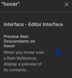
Search in settings for “hover” and toggle the only thing that comes up.
However it exits quickly; it won’t let you scroll the scrollbar in the preview
Thanks UMNiK. I also miss the Preview-on-Hover in the Sidebar. I didn’t see way to toggle that.
Hi! I’ve been a fan of the product for quite some time now. It’s been great.
The update has been great. However, the way I use it sometimes is I would collapse ascendant rem to hide all the descendant and the ones under them. The way it looks gets really long sometimes. And would feel cluttered. So then, I would collapse the ascendant rem to hide all the immediate descendants and the ones under them (sub? is that the term?) then re-open the ascendant so that only the immediate descendants would appear since the ones under them would then remain collapsed. On the update, though, whenever I collapse ascendant and then re-open it, everything stays the same. Is there an option to choose the former way? Please help. I’ve really gotten used to the old way and it really serves a purpose for me.
use the option “hiding” instead of “toggling”. You can read the detail here
RemNote 1.4 - the Redesign update is here for all Pro and Life-Long Learners!
So, by default it will toggling with the old version. If you want to hide you need to use Hide Rem. And beware of using command Include All Descendants so, this will include all of the hiding rem. Only use Expand and Collapse, it will remains the same hiding rem.
List of shortcut
- Expand (Ctrl + ⇩)
- Include All Descendants (Ctrl Shift + ⇩)
- Collapse (Ctrl + ⇧)
- Hide Rem From Document (Ctrl + Alt + H)
Oh ok. This will get some time getting used to. Since I’ve programmed the old shortcuts in my macropad. O well. Change is good. Thank you!!!
BTW, I found a solution that works for me. If I want to appear only the immediate descendant rems, I only need to click on the ascendant rem and press Ctrl Shift + ⇧.

