Table / spreadsheet functionality

Often there is content that can only be properly displayed in a table format (especially when you want to be able to see a large number of entries at the same time).

This is already in the roadmap. I’m creating this to have a single place where users can comment, suggest features and implementations on it.

Essential functionalities for me would be to be able to:

  • Generate a table by (1) defining a search criteria and (2) choosing which slots are columns.
  • Sort entries by column (ascending/descending)
  • Add/remove/edit entries directly in the table (effectively the same as creating Rems)

Ideally this would allow users to have the equivalent of master databases (RemBases?), and include views to it for specific Rems.

This function is described precisely and elegantly here.
Please keep that in mind.
The only problem is that I can’t think of how the columns could be resized or cells combined in this way.

3 Likes

Yes, add this please!

1 Like

How about this?

It has no query functionality, but it is a start.

Or just plain columns like Notion:

Please upvote here: Custom Rem-level formatting with tags

Edit: Oh, I forgot. Sorting works too of cause:

15 Likes

Nice work! Being able to display Rems in different ways is incredible.
Definitely super useful.

I’d still like to have proper table functionality though. Each row should represent an entry, with the headers being the “slots”. The way you did it, the Rems are independent - more like columns.

Again, still amazingly useful, as are your other examples. Will vote on your Rem-level formatting post now. :smiley:

4 Likes

I think I can do that as well. Will try and post tomorrow. I need something to continue the hype anyway :stuck_out_tongue:

But I agree: A native implementation should be the goal. In the CSS only version the arrow keys will be funky.

Edit: @ognsya here it is, Data taken from the Dynalist link above:

I had to fix the width of the first column, otherwise number of columns is flexible.

2 Likes

Nice!

Is that just CSS or are you using JS/plugin?

Can you share how the Rems look like without the #Table label?

1 Like

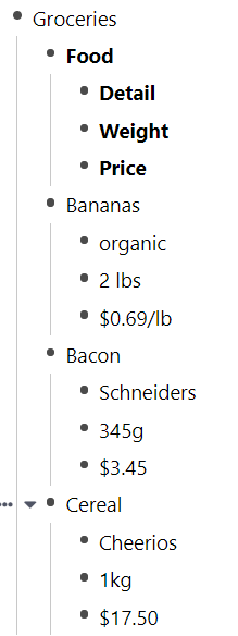
Just CSS (+ a little user script to make the markup like in Custom Rem-level formatting with tags which will not be required once implemented). The data looks exactly like the Dynalist example:

1 Like

Ah ok. Got it!

I thought you meant it was using the slots.

Slots is more tricky using only CSS. You’d need a CSS snippet for each kind of table you want (Groceries with Food, Detail, …; Books with Title, Author, …) because you can not draw the header from the template when it is somewhere else and you have to mention all tags/slots explicitly. This makes sense for fixed templates, like a person though.

3 Likes

Not someone who knows how to code, but is there anyway that a flashcard feature could be implemented for cells within the table? To hide one cell/ one column/ one row at a time in each flashcard?

3 Likes

Hey, thats amazing stuff… is it possible for me to use it (like a anki add on) ??

Working on the release right now actually. :smiley: I’m ready soon™

6 Likes

Just to be clear on this: My snippets are just visual sugar to display normal rems in multiple colums or make them look like a table. This means:

  • Things like sortable or filter columns will never work (except with what is possible with the Automatically Sort Power Up).
  • And the table data must be written as direct children of the parent which is formatted as table/columns. It is not possible to collect it from template instances for example.
  • When using template instances (with descriptors) as content they still show the descriptors in a table cell. Of course they can be hidden (and only shown when focused) with even more CSS.

More powerful table support must be implemented as a plugin or builtin.

Keeping that in mind, which kind of tabular thing are you most interested in (see other replies for demos)?:

  • Columns - Plain and simple, like in Notion.
  • Column Tables - All children of a parent form a column with the children name used as the heading and its children as cells.
  • Row Tables - The first child and its children will be used as headings. All following are rows. (See “Groceries” example; this is the hardest to implement)
  • I don’t need any of these gimmiks. I want real tables!

0 voters

1 Like

To be honest, I’d probably avoid tables until they are properly implemented within Remnote (as you said, your solution is a temporary one).

If I may make an argument for column tables: they seem like the most future-proof version, since they should maintain some readability even if they return to their outliner form. With your earlier worries about updates to css breaking things, this seems like the safest option. Great stuff as always!

3 Likes

I agree with you and Hannes. tables are vital in some use cases (not everything can be in the form of bullets). So it’s best if the RemNote devs actually go ahead and implement tables as a builtin functionality, with card features.
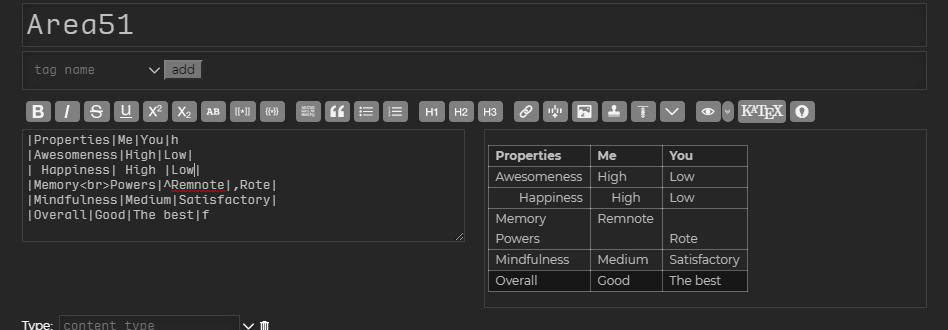
And as for the plain columns like Notion, I can’t tell you how much I want a table thing in Notion. Making an entire database for something like similarities and differences is really weird. And plain columns easily lose their row-height stability, so it’s not good for tables. And the lines are gone as well. I remember making tables like this in TiddlyWiki:

Note that I can do alignment with spaces for horizontal, and ^ or , for vertical. that h or f in the end denotes headers and footers, which would work even if I put that h in any other row as well.
It’s simple and it works like magic. I was using TiddlyWiki before I found RemNote.
Maybe something like this could be done. Just an idea.

1 Like

@Martin / @mattygrov I see a table in this screenshot. Does this mean we’re getting tables soon? :smiley:

2 Likes

Looks like just an screenshot of a table

ETA for official table feature in RemNote?

2 Likes