There were many Discord Suggestions asking for improved formatting options
While these are important features for RemNote 1.0 they are tedious to design and implement.
Adding the (normalized) tag names of a rem as a CSS class is easy to implement and provides a flexible solution for rem-level customizability. Example use cases include:
Demos
Basic text styling
- Font-size
- font colors
- more background colors
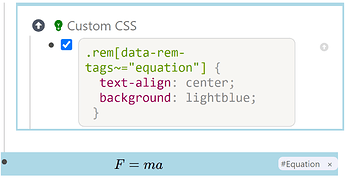
- text align (left, right, center was asked 3 times - especially useful for latex equations)
- strike-through
TODO: Todo customization
-
#todo- bold -
#todo#urgent- bold red on yellow background -
#important- red, larger font -
#quote- cursive, quoted on a grey background
Requested
Legend:
-
 implemented
 -
 ♂ in progress/partially implemented
 -
 missing
Most of this got implemented in the November 2020 update. There are still a few things QoL things that I’d like to see. This list is WIP. I’ll add things when I find them.
Allow to add and remove tags via the API.
This way we can connect a style to a shortcut.
Martin said that they are considering adding tag management as builtin shortcuts. This would be much better of cause. Still this needs to be an API feature at some point.
For now you can use a text expander/shortcut ulitity like Auto(hot)key/Keyboard Maestro to paste tags.
✅ Move tags to the top of the Rem
This is because CSS selectors only can go down the tree.
This makes it much, much (!) more powerful because it allows styling a whole subtree and not just a single rem.
🏃♂️ (Semantic) CSS Classes
Make sure every part of the UI can be targeted with a CSS class. I don’t know places where this is not the case (there could be though) but these two imporant ones:
-
.tree-node-container > #Pane...should be a.parent-nodeand -

.tree-node-container > #TreeNodeChildrenPane...should be.children-nodes(currently.TreeNodewhich works too but could be renamed/augmented). - More classes when editing a rem.
-
 E.g.
E.g. ::should get a class. - And things before and after it as well. (See also point 4).
-
Update: @ognsya pointed out below that we also need classes for structures that are not described by tags:
- CSS classes for Rem Types: Concept, Descriptor, Question, Slot need to be annoted in top level in .tree-node-container. (We have
.rem-container--*-rem-type, but it needs to be top level.) - Filled in slots in template instances get an extra data tag because they would be just identified by a reference and not a tag. This already works, but only as long as you leave the little x for the TypeParent/TypeChildren relationship. There should also be a way to reset this relation. I would also like it to not be a
rem-data-tagbut arem-data-slotattribute to have the semantics better expressed.
✅ Page/Document Tags
Similar to 1 add tags also page/document. This allows documents to be styled differently, e.g. have a special style for Daily Documents, meeting notes, workout log, … (infinite possibilities here, multiplies with 1.!) or implement features like enabing a sidebar on some pages.
🏃♂️ Static DOM
Update: This is hard. When you hover over a rem it gets transformed to the slate editor instead of static markup. This way it is easy to place the cursor when clicking.
Have the markup change as little as possible on hover/focus. Only apply display: none/visibility: hidden instead of removing it from DOM. This makes user styles more flexible. For example you can always have the toggle button. I’m not an expert for React performance, but I feel like manipulating the DOM/mounting components is equally costly as a leaving extra elements in the DOM (Stackoverflow: Conditional Rendering vs. Hiding, Stackoverflow: visibility: hidden vs display: none;). (My intuition is use Conditional Rendering if it is done only once. If it is often shown on hover use visibility: hidden because no DOM reflow. display: none removes it completly from the rendering.
Less Tag Normalization
Not necessary, more of a QoL. Currently it is quite aggressive. When a rem with the text Rating: 5! is used as a tag the data attribute is just rating. A less aggressive algorithm would be:
- lowercase
- strip everything except
a-z,0-9,_and whitespace - turn sequences of whitespace to
-
Markup Improvements
It is a kind of technical dept and later changes are harder to do because more things (Mobile App, Desktop App, Web, User Themes) depend on it. It is not a well defined task where compromises have to be made. Changing to much will break current user themes (I pledge to help fixing them if required.) I also understand completely that this is no priority right now because it has no obvious value for the average user. Maybe we can leave it as it is, but it triggers my OCD  Here are a few things I have found - the more that get fixed, the better:
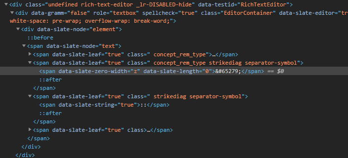
- There are a bunch of
.*_rem_type > span[data-slate-zero-width="z"][data-slate-length="0"]which are hard to work around. They should be removed. - Useless
.rem > div. This does not seem to serve a purpose. It could be merged with the parent tag. -
#hierarchy-editor-referencesand.hierarchy-editor__tag-barshould be outside.rem-text. - One useless
spanparent of.rem-bullet__container. (One is used for the hidden children search box.) - Different naming conventions
.EditorContainer(CamelCase) vs.rem-container--default,.bullet-point__container(BEM) - Use classes instead of IDs (not really important, but can technically be improved), like
#hierarchy-editor-referenceswhich exist multiple times. These seem to be artifacts from early RemNote versions, i.e. pre two pane layout. - Generally select using the smallest possible selector. (Especially time intensive…) This makes overwriting styles easier. E.g. one does not have to throw in a random
#idbecause it is also in the builtin stylesheet or an!important.
✅ Allow indented and hidden code blocks on Custom CSS.
You can nest CSS blocks under headings and fold those headings.
Added after November 2020 Udate
🏃♂️ More concistency
This is a future investment.
🔴 .parent class
🔴 Eaiser to use data-document-tags (.document-content) class
More semantic/concise/robust than
#document[data-document-tags~=specialdocument] #hierarchy-editor-list__inner
> div:first-child
> div:nth-child(2)
🔴 .data-rem-container-tags when opening the rem
You can target the children of a tagged rem both when the rem is opened as or inside a page, but it is not semantic at all:
/* Option 1: almost the same as an unopened rem */
[data-rem-container-tags~=todo]
> :nth-child(2) /* Children of the page. The first one being the .root-tree-node-content for the page itself where hidden rem of the page might be displayed */
.rem-bullet__container {
  background: blue;
}
🔴 Handle SlateJS zero width spaces
In the above example I can not select with
.separator-symbol. IIRC I read in a Github issue that those can’t be removed, but maybe somehow worked around to not receive a css class?
- rem id as data attribute (I just thought of that. This is not necessary for styling, but useful for a browser extension.)
- easily selectable document root document root
-
.TreeNodeLeftBorderis a sibling of.tree-node-containerwhich makes it impossible to use:nth-childreliably. I assume for now this setting is disabled. - add data tags to tag buttons
- This makes it possible to hide them (unless focused)


 I’m actually starting to become interested in coding because of posts like these.